Google Sheets is a spreadsheet program that is a part of Googles web-based office suite. The program represents an online alternative to Microsoft Excel but it’s compatible both with Microsoft and Open Office file formats.
Since its initial release, back in 2006, there is an ongoing debate whether people should use Google Sheets or MS Excel. There’s no right or wrong answer to this. It all comes down to specific needs and tasks.
Someone would praise Google for its simplicity and ease of collaboration. Others would argue that Google Sheets, compared to Excel is lacking in the functionality department
Google Sheets vs Excel
Nowadays, in the modern business environment, time is the most precious resource. No wonder that many accountants and business professionals decided to move toward using online office tools like Google Sheets instead of the old-fashioned MS Excel.
The place where Google Sheets shines the most is collaboration. Multiple people can edit and make changes in real-time which outweighs e-mailing Excel files back and forth. A sidebar chat allows them to discuss edits on the spot. Furthermore, everyone can see the changes as they occur and make modifications on the go.
However, there’s a downside to Google Sheets. When it comes to large-scale data analysis Excel wins the fight hands down. Google sheets can’t compare to Excel’s raw data processing power. If you need to work on a high volume dataset (over 1000 rows of data) Excel is the go-to tool, as it can work with thousands of rows without compromising its performance. Although, Google Sheets is catching up with formulas and charts if you need to get some serious work done Excel is the more likely choice.
Pivot Tables
Now that we explained the basics behind Google sheets and and have seen how it compares to Excel, let’s take a closer look at one of the favorite features of spreadsheet power users: Pivot Tables.
Analyzing a large data set can be really confusing and tiresome. Fortunately, Pivot Tables are a perfect solution for such a task. They can help you find some meaning in your data and get a better understanding of it. Moreover, you can present data in an understandable form.
Taking a look at your data from another angle is a great way of getting a new insight. The good news is that you can use Pivot Tables in Google Sheets, as well. So if you’re partial to the online suite, today we’re guiding you through the basics of creating pivot tables and analyzing your data.
Creating Pivot Tables
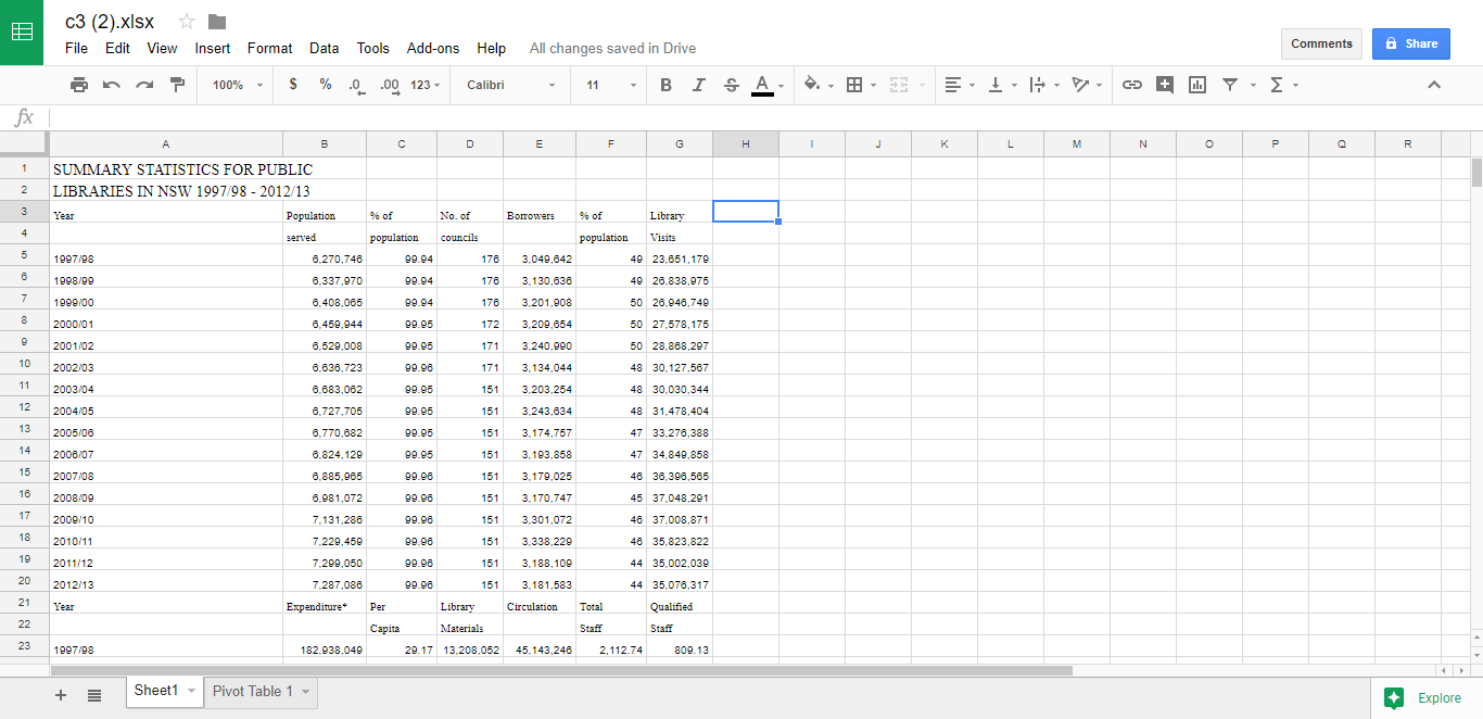
1) Open Google Sheets and locate the spreadsheet that contains the data you want to analyze.

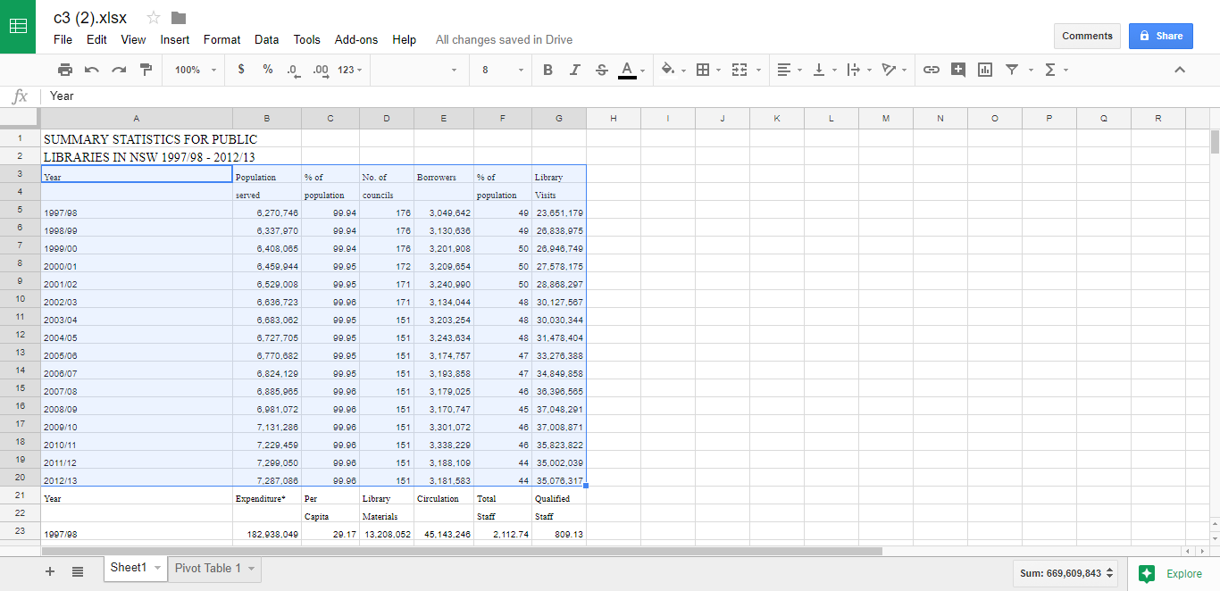
2) Select the cells with the data you want to use

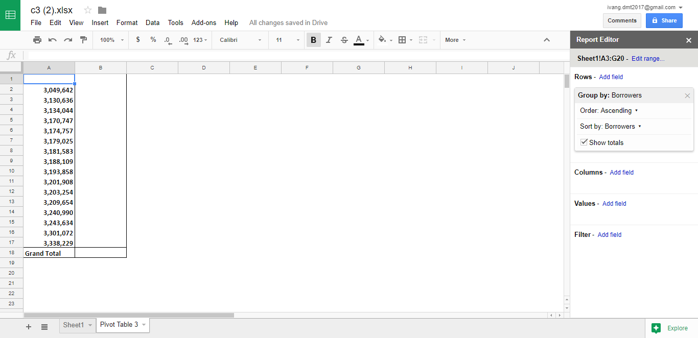
3) Click on Data and in the drop-down menu select Pivot Table. After that, a new sheet will pop up.

Now you have a Report Editor window located to the right. Here you can customize what information you want to see and analyze in your Pivot table.
With the Rows and Columns sections, you get to choose what rows and columns you want to work with. In the Values section, you can summarize and show numerical amounts. The Filter section enables you to hide the data that you don’t need to show in the table.
If you want to make changes to how your data is ordered, sorted or summarized you can do that by clicking on the Down Arrow in the respective section. Furthermore, you can move a data set from one category to another by dragging it.
Bottom line, Google Sheets is a neat tool for light data analysis work, especially when more people need to work together on it. Although it’s not on the same level as Excel, it has its place in the business world. Pivot tables are a great tool for displaying only the data relevant for analysis. A simple yet effective way to summarize huge amounts of data in a user-friendly way.


